Case Study:
The Florist
Responsive website design
Give them their flowers
The Problem:
A small business faced challenges in expanding its reach to a broader audience. Local customers found it inconvenient to visit the store to view flowers, and there were also extended wait times for phone orders.
The Solution:
Develop a responsive website that enables customers to virtually browse products and swiftly place local delivery orders with ease.
My Role:
UX Researcher and Designer (Individual Project)
Responsibilities:
User research, wireframing, prototyping, conducting usability studies, design iteration and accessibility.
Tools:
Figma
Understanding the Users
User Research
Persona
Problem Statement
User Journey Map
Research Summary
We interviewed users to gain insights into their preferences for a responsive florist website, with a primary focus on young adults and professionals with busy schedules. Initially, it was thought that lack of interest in visiting a physical shop was the main factor. However, further research revealed that factors such as obligations, interests, and desires also played a role. In an increasingly technological world, florists need to adapt their practices to cater to the evolving preferences of a mobile society.
Persona: Anika Samuelsson
Anika Samuelsson, a Marketing Intern, requires a mobile-responsive website for ordering flowers to ensure convenient access from her phone.
User Journey
The objective is to navigate the website effortlessly and seamlessly add products to the cart on both desktop and mobile platforms.
Pain Points
Aesthetics
One significant issue identified was related to aesthetics. Some florist websites were excessively colorful, making it challenging for users to navigate, with some even experiencing physical discomfort in their eyes.
Labeling
Labeling poses a significant challenge on florist websites, with inconsistencies observed. Some websites categorize certain flowers differently, leading to confusion, as there is a universal categorization, such as for Lilies and Orchids.
Starting the Design
Paper Wireframes
Digital Wireframes
LoFi Prototype
Usability Studies
Paper Wireframes
Paper Wireframes
The objective of the paper wireframes was to strike a balance by displaying products without overwhelming users with information overload. While the initial idea was a round-robin style cycle through the products, it was recognized that users might find this search method too tedious.
The goal was to maintain consistency in content across both screens without compromising accessibility or the overall flow. To optimize space, we consolidated navigation into a hamburger icon and made adjustments to the images for enhanced accessibility.
Digital Wireframes
Digital Wireframes
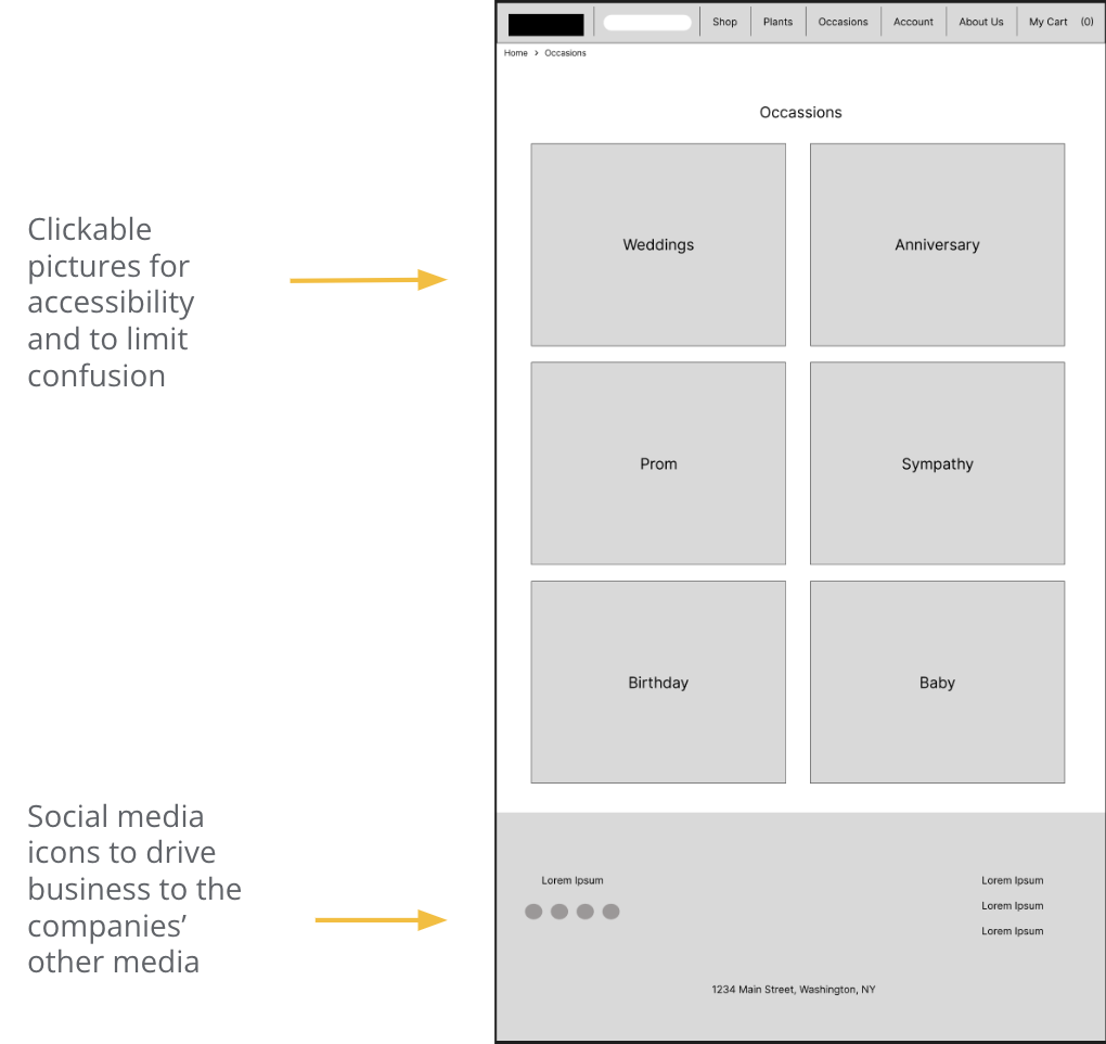
I aimed to make the products clickable for space efficiency and improved accessibility. Additionally, we strategically placed links to social media accounts next to the "About Us" and "Store Locator" sections to encourage users to explore the owners' additional media platforms.
I wanted to keep as much content the same on both screens as we could without losing anything from accessibility or the flow. We condensed everything into a hamburger and cart icon to save space and readjusted the images for access.
Low Fidelity Prototype
Parameters
STUDY TYPE
Moderated
PARTICIPANTS
5 participants
Usability Study
LOCATION
DFW Metroplex, TX
LENGTH
15-20 Minutes
Findings
Participants expressed a desire for an improved means of identifying their location within the app, a more prominent logo, and a streamlined process to reduce the time spent filling out their information.
Following the results of the usability studies, certain modifications were implemented. These include transforming the logo to resemble a button, thereby encouraging clicks to get back “home.” Additionally, the page name is now underlined to enhance user awareness of their location, and a box was added to streamline the process of filling in delivery information if it remains the same as the previously entered details. Users also found value in the subdued and darker color scheme of the website, as it effectively accentuated the flowers and their vibrant colors.
Refining the Design
Mockups
High Fidelity Prototypes
Accessibility
Mockups
HiFi Mockups
Conducting a usability study on a high-fidelity prototype revealed feedback suggesting the addition of a checkbox to automatically populate the address, eliminating the need to fill out the same information twice.
HiFi Mockups (cont)
After a usability study, the logo size was changed and increased for visibility. The text and icon, in the middle of the page, were altered for accessibility.
High Fidelity Prototype
Going Forward
Conclusion
Next Steps
Conclusion
I found joy in both the design process and the learning experience throughout this project. Prioritizing a user-focused approach was consistently at the forefront of the design process, and conducting numerous usability studies played a crucial role in crafting an excellent user experience.
Competitive audits and usability studies played a pivotal role in shaping decisions and establishing effective flows, as users had specific desires and expectations for a website with this subject matter.
Next Steps
The upcoming phases of the process involve conducting another usability study focused on the responsive aspect of the website, specifically examining its flow on mobile devices. Additionally, there will be an iteration on additional mobile wireframes and flows aimed at either continuing or enhancing the user experience established in the main desktop flow.
Furthermore, I would ensure that both headers and images are made accessible to screen readers, facilitating navigation for individuals with visual impairments on both desktop and mobile platforms.
Any questions or comments?
Email me at avery_taylor@ymail.com.
Let’s connect!


