The Pizza Hunt
A redesign of a popular dedicated mobile app specializing in pizza and pastas.
The Problem:
Busy young adults and professionals want an app to quickly and efficiently order food while on the go.
The Solution:
To design a restaurant ordering app that prioritizes ease of use, enjoyment, and user-friendliness, with minimal input required from users to guarantee an outstanding user experience.
My Role:
UX Researcher and Designer (Individual Project)
Responsibilities:
User research, wireframing, prototyping, conducting usability studies, design iteration and accessibility.
Tools:
Figma
Understanding the Users
User Research
Persona
Problem Statement
User Journey Map
Research Summary
I interviewed users to gain insights into their preferences for a mobile food ordering app, with a primary focus on young adults and professionals with busy schedules, preventing them from preparing their meals.
Initially, it was believed that these user groups simply lacked the desire to cook, but further research revealed additional factors. Obligation, interest, and desire all proved to be limiting factors in users preparing their meals, in addition to time constraints.
User Persona
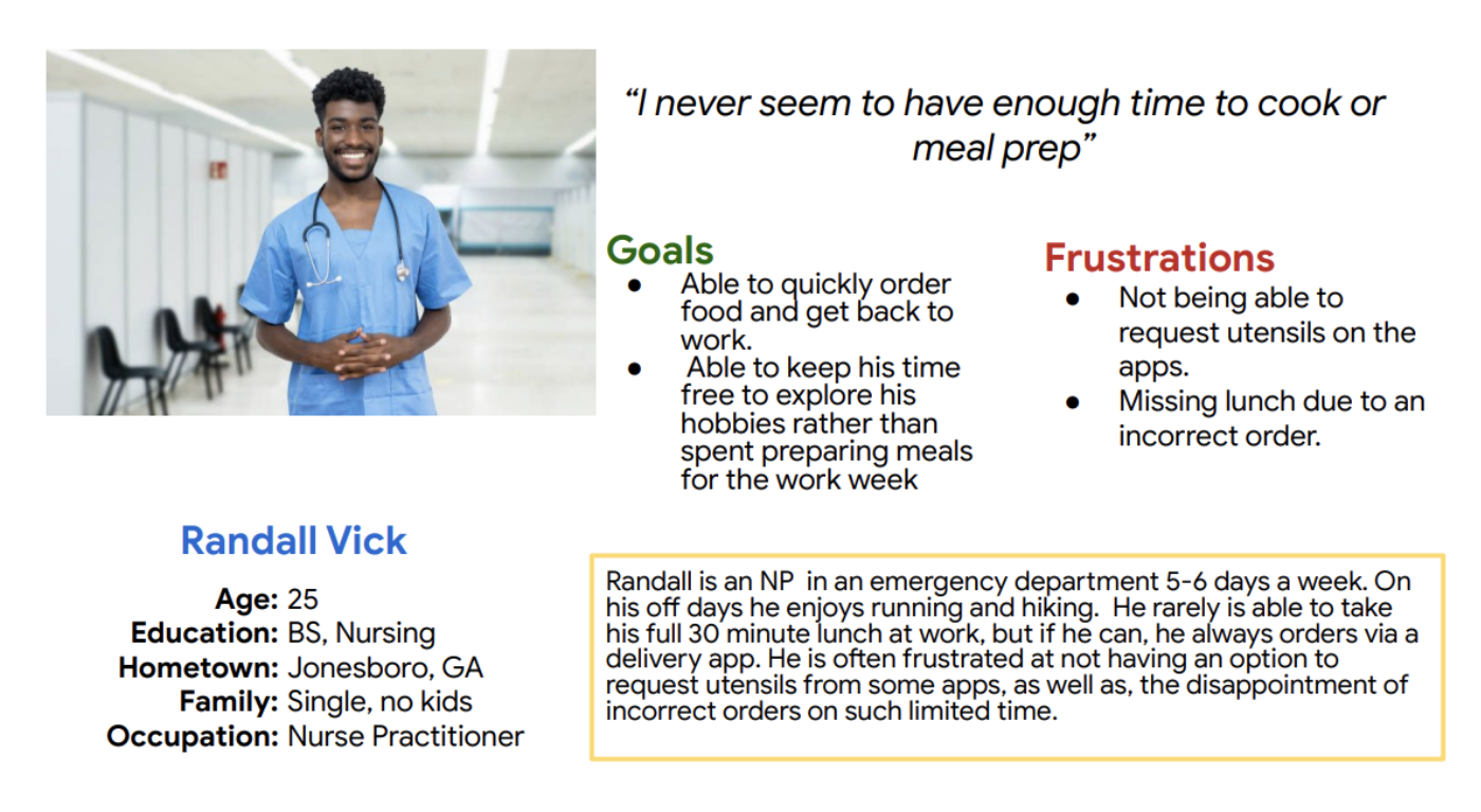
When developing user personas for the Pizza Hunt app, it was essential for me to gather data on potential users' demographics, behaviors, and needs. Conducting research through surveys, interviews, and data analysis to identify patterns and insights informed my personas’ characteristics. By understanding the target audience (young adults and busy professionals between the ages of 18-45) I was able to tailor the app to meet their specific needs efficiently and effectively.
User Journey
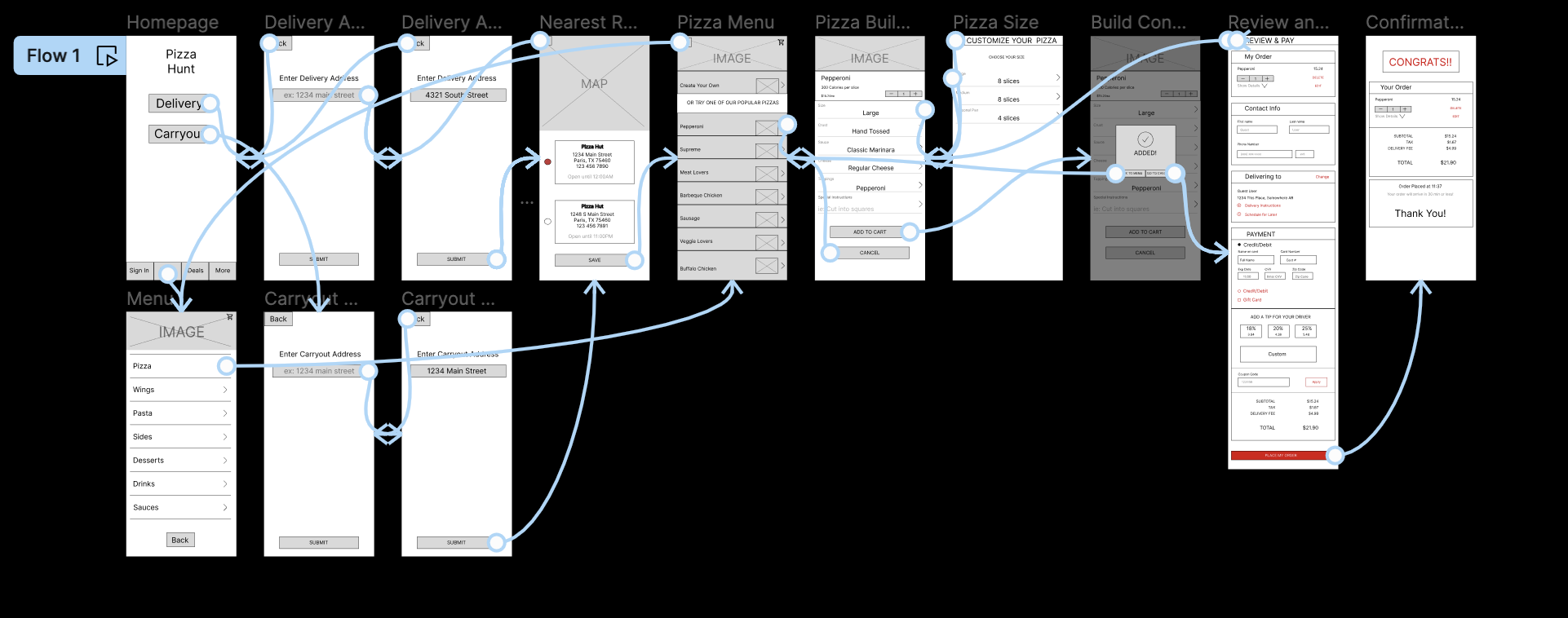
The objective is to swiftly complete an order through a streamlined process, minimizing any anxiety or uncertainty the user may experience during the transaction.
Starting the Design
Paper Wireframes
Digital Wireframes
LoFi Prototype
Usability Studies
Paper Wireframes
Paper Wireframes
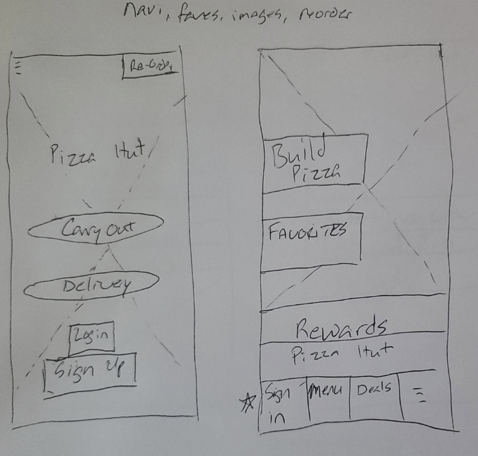
The objective was to design a home screen that enables users to swiftly access their orders without needing a splash page. Initially, the plan included incorporating imagery, navigation, and a favorite tab for saving previous orders, especially for users with an account. However, I ultimately opted for a simpler design to remain user-centered.
Digital Wireframes
Digital Wireframes
Another objective was to showcase pictures of menu items while ensuring that users encounter the "create your own" feature first.
This arrangement acknowledges that users often have a preconceived idea of their preferences before accessing the app.
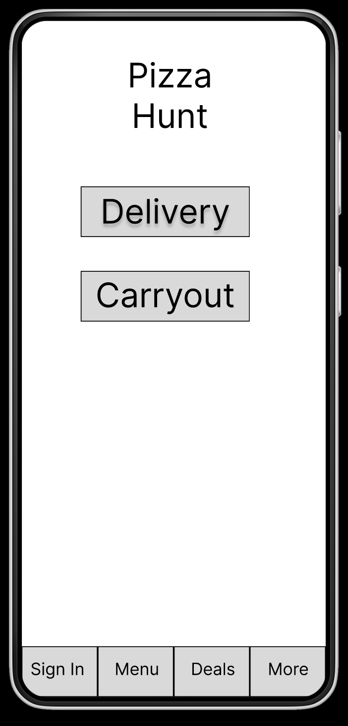
One of the objectives was to bypass a splash page and promptly lead users to the order interface.
I aimed to avoid distracting users with deals and signup buttons but provided the option for users interested in those features at the bottom of the screen.
Low Fidelity Prototype
Parameters
Study Type
Moderated
Participants
5 Participants
Usability Studies
Location
DFW Metroplex
Length
15 - 20 minutes
Findings
From the first usability study, the majority of users expressed a preference for providing minimal information. They favored having the "continue as guest" option as the primary choice, with the sign-in option being secondary. Consistency in button placement was also highlighted as a preference throughout the user flow.
The second usability study revealed the majority of participants found the text size on the checkout page to be too small. A few users desire the ability to switch between delivery and takeout options seamlessly during the ordering process. Many users found it unclear how to utilize the tip buttons.
Refining the Design
Mockups
High Fidelity Prototypes
Accessibility
Following the usability study, feedback indicated the need for a more consistent layout. As a result, a header was incorporated, and pictures of the food were added to the mockups based on the study findings.
Mockups
Pre-usability Study
Post-usability Study
Pre-usability Study
Post-usability Study
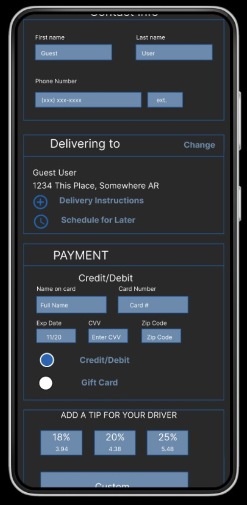
Feedback received from the usability study indicated that the checkout page is cluttered and required streamlining to enhance the overall user experience by making it more user-friendly.
High Fidelity Prototype
Accessibilty
I took into account that bright colors might pose visibility challenges. Therefore, I created a color scheme that primarily consisted of darker colors complemented by brighter text to enhance accessibility.
I am aware that some individuals struggle with smaller fonts, so I took deliberate steps to bolden all smaller fonts. Additionally, I ensured that the contrast of larger fonts met industry accessibility standards.
Moving Forward
Conclusion
Next Steps
Conclusion
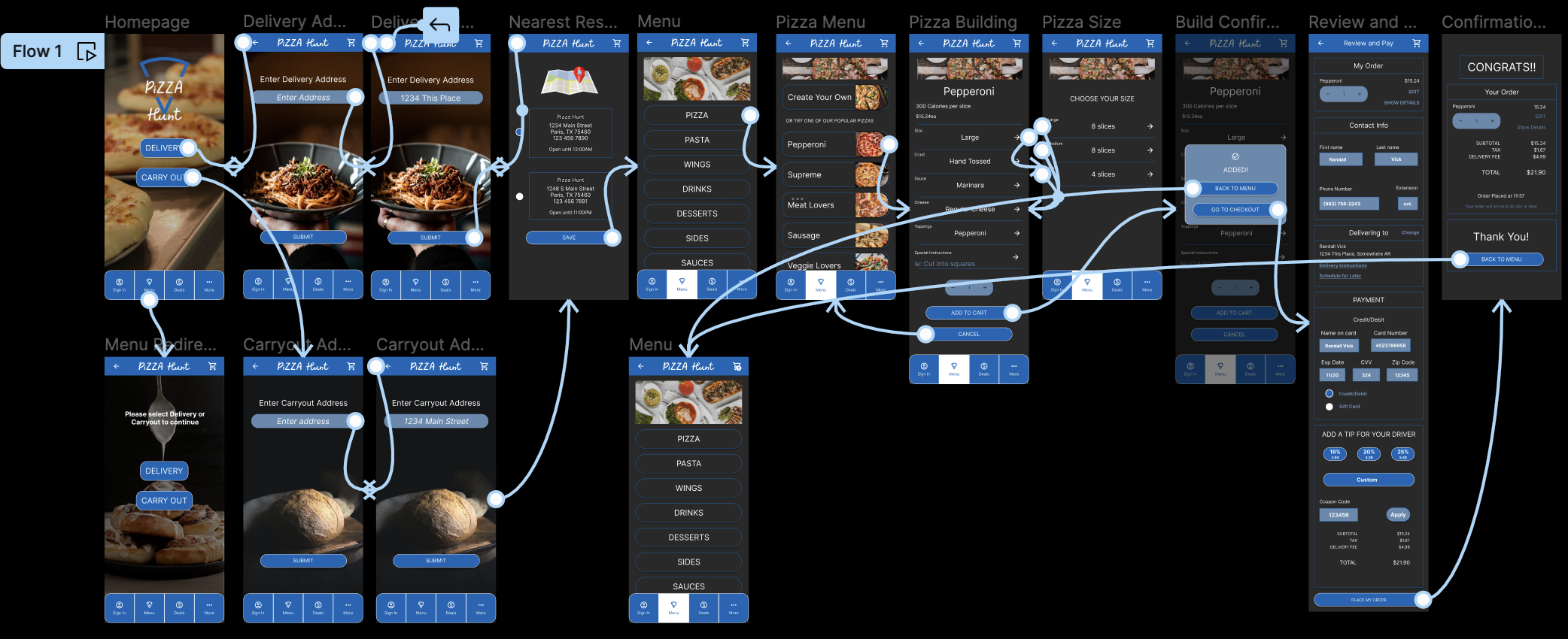
Initially, I believed users would be hesitant about not having a splash page and would be compelled to choose between delivery or carryout before accessing the menu. However, I was surprised to learn that most participants preferred selecting delivery/carryout before viewing the menu to avoid any surprises during the checkout process and user flow.
I learned not to lean too heavily on my ideas as they may lead to biases. The designs I create are not for myself or the developers, they are for the users. Therefore, I should remain open to the input and perspectives of others to produce greater, more accessible designs.
Next Steps
I would begin refining the remaining pages of this app to develop a more comprehensive product, prioritizing the user experience throughout the design process. Additionally, I would start recruiting participants for another usability study to verify that the ongoing improvements maintain a seamless flow and do not introduce any new challenges.
Our goal is to improve the app's accessibility by ensuring it is compatible with screen readers and incorporates voice activation features.
Any questions or comments?
Let’s Connect!!

